From a young age Icelandic product designer Theodóra Alfreðsdóttir knew she would follow an artistic path, and was particularly inspired after she watched the film Mrs. Doubtfire. Sally Field’s character, Miranda, a mother and interior designer, had beautiful sketches and fabric swatches that Alfreðsdóttir was fascinated by.
When Alfreðsdóttir began seriously considering her options, she thought architecture might be more practical and started foundation studies with that in mind. As she learned about the field, though, she realized that she craved a faster-paced environment. Around this same time, conceptual product design was emerging in her native Iceland, and she made an immediate connection. “The experimentation and playfulness felt like a natural progression,” says Alfreðsdóttir. “Rather than designing spaces, I would be designing the objects that bring them to life.”
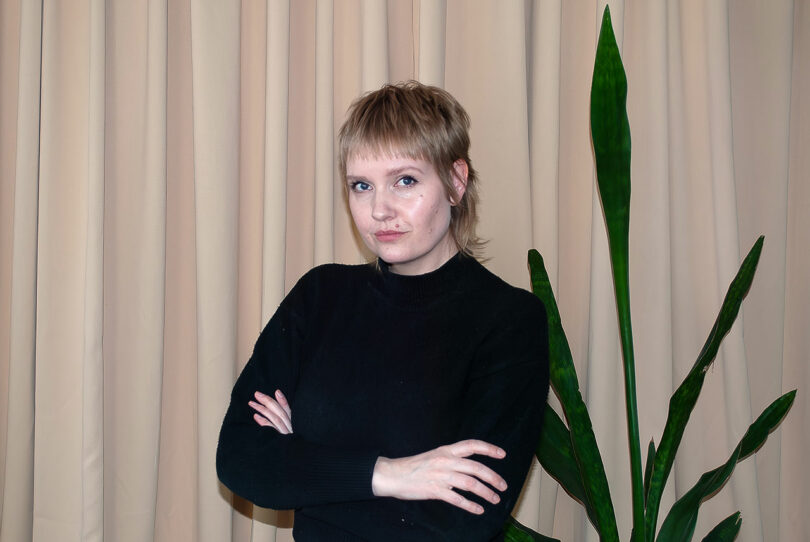
Theodora Alfredsdottir
Based in London, Alfreðsdóttir heads her eponymous practice and is also an associate lecturer at Goldsmiths, University of London. She strives to give students a better understanding of what goes into bringing an object into this world. In lessons and her own work, she shows that each item is a record of what went on between the machine, tools, craftsman, and material.
Alfreðsdóttir is surrounded by items of all kinds, yet Buno Munari’s “illegible books” left a lasting impression, and still resonate for her today. These volumes, however, discard textual communication and serve a purely aesthetic function. Instead of a title, words, or numbers, vibrant pages communicate to the user via color, form, and pattern. For Alfreðsdóttir, it is an example of how good design invites sensory exploration and sparks the imagination.
Even with a full schedule, the product designer still finds time to work on other projects, serving as both an art director and prop stylist. If she decided to pivot to another arena she would love to delve into the collaborative world of photoshoots. “There’s something magical about the behind-the scenes tricks that bring the final image, not to mention the energy of working closely together with a creative team,” adds Alfreðsdóttir.
Today, Theodóra Alfreðsdóttir joins us for Friday Five!
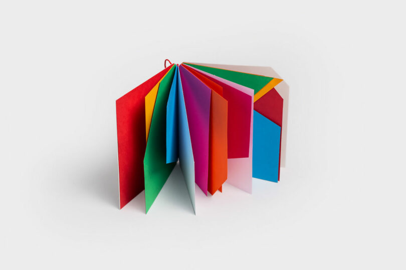
One of Bruno Munari’s captivating illegible books, where colors and shapes alone weave a visual narrative through their interactions. Discovering these powerful works during my BA left a lasting impression, shaping my design language in ways I’m still uncovering today.
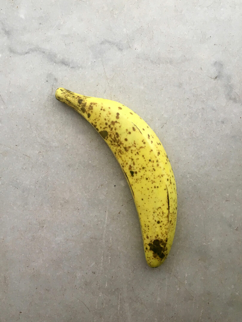
Photo: Theodora Alfredsdottir
2. Marble banana
One of my most intriguing possessions: a marble banana from Carrara, Italy. It plays with material and value, turning luxurious marble into an everyday object – a reminder of how context shapes our perception.
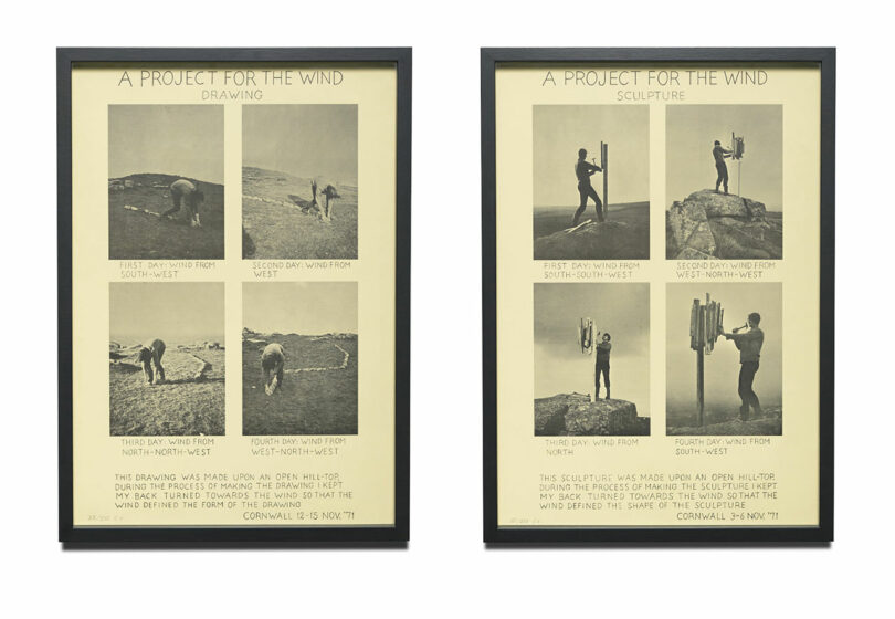
Photo: Courtesy of Hunt Kastner
I admire Sigurdur’s work, deeply rooted in it’s surroundings and the intangible. Once, I read about his creative ritual: he’d sit in a sparse room, fueled by coffee, cigarettes, and a bit of dark chocolate, contemplating words until one resonated. Then, he’d dwell on it intensely, letting connections form and ideas emerge. A charming process – a reminder that inspiration often comes from the simplest rituals
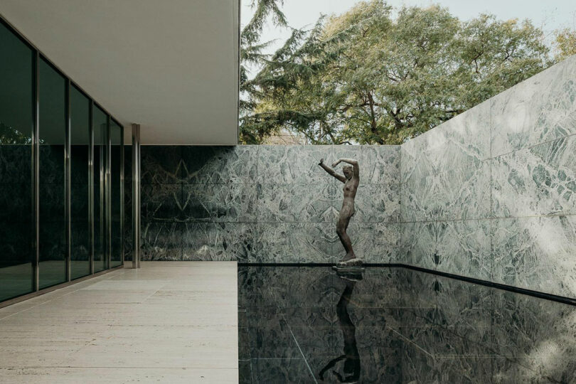
Photo: Maciek Jeżyk, courtesy of Ignant
The Barcelona Pavilion by Mies Van Der Rohe is one of my favorite spaces. Its seamless harmony of materials, shapes, and textures is stunning – a modernists dream! The pared-back design feels so refined, but achieving this level of simplicity is incredibly challenging – the most effortless-looking things are often the hardest to accomplish
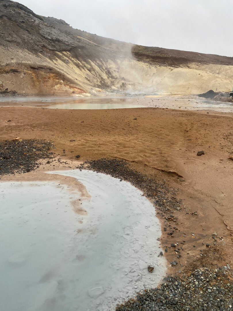
Photo: Theodora Alfredsdottir
5. Icelandic Nature
Icelandic nature is woven into my work, inspired by the landscapes I miss daily. From black sand beaches to glaciers, geothermal fields, expansive lunar plains, the endless sea, and towering volcanic peaks – Iceland’s raw power and shifting palette of colors and textures fuel my creativity.
Works by Theodora Alfredsdottir:
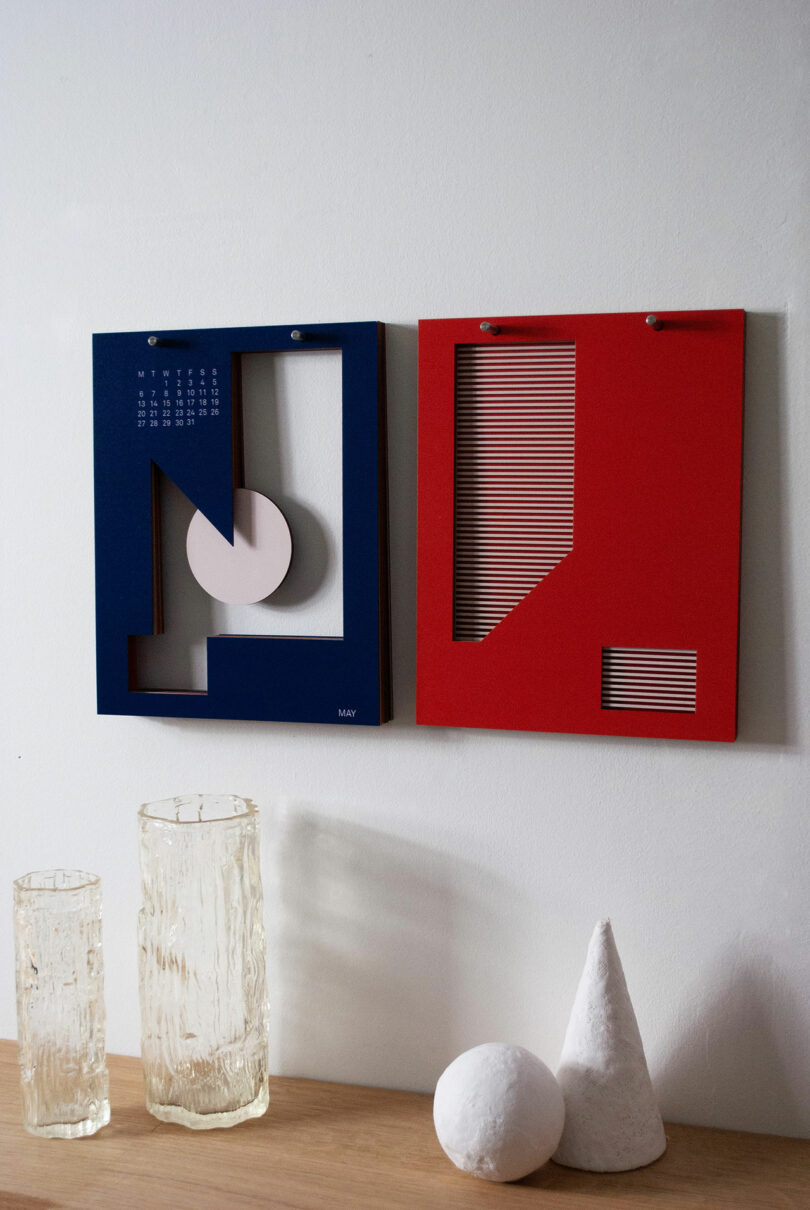
Photo: Theodora Alfredsdottir
Calendar 2024
Calendar that transforms time-tracking into a visual experience. Inspired by a conversation with my dad about our synesthesia, both of us see colors and shapes when thinking about months, and this unique calendar brings that perspective to life.
Utilizing four wall based pins, 13 sheets hang in a composition from two, where each page has a month of the year on. Completed pages are flipped onto the other two pins as the months pass, creating a captivating artwork by the end of the year – a visual journey through time and memories.
At the end of the year the artwork is yours to shape; leave it in the original composition that I designed or feel free to get creative. Divide and arrange the pages to craft two distinct artworks that resonate with you.
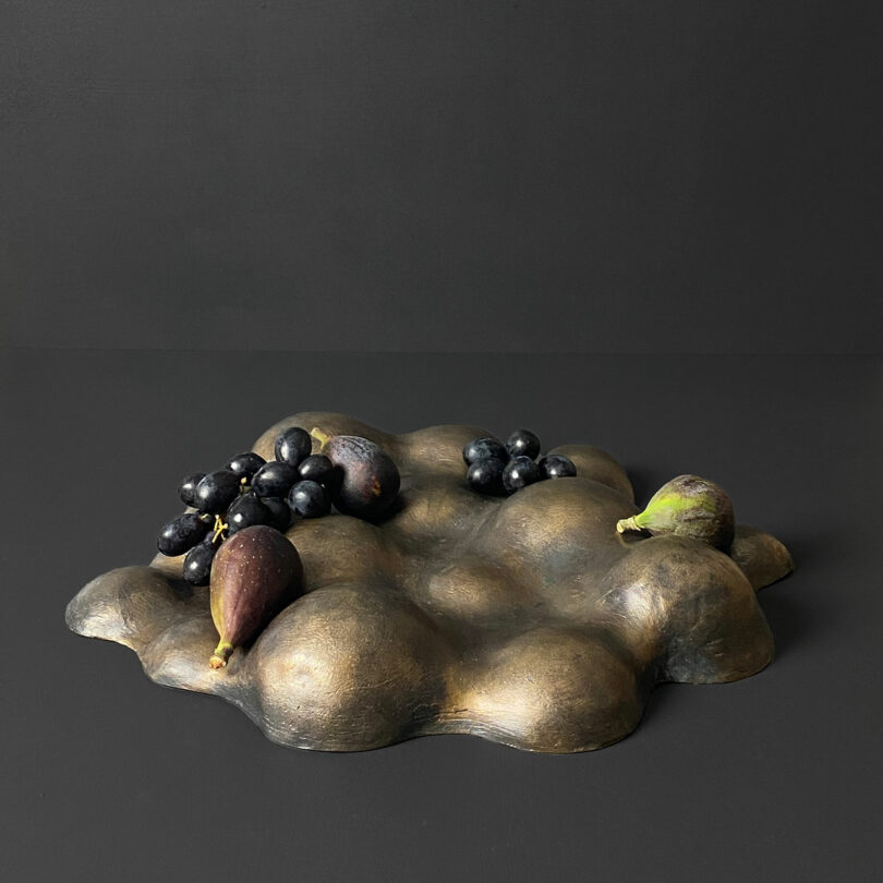
Photo: Theodora Alfredsdottir
Fruit Bowl for The Farm Shop, Grymsdyke Farm + Fels
This fruit bowl embodies the timeless cycle of nurture and harvest, honoring nature’s bounty through the art of lost wax bronze casting. Inspired by Grymsdyke Farm’s blend of tradition and creativity, it invites us to celebrate the beauty and craftsmanship rooted in the rhythms of farm life
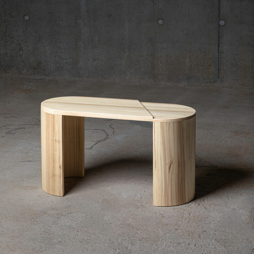
Photo: Studio Frae
CC-01 Bench
A place to drop your bag, sit on to tie your shoe laces or just take a moment for yourself before transitioning into the next chapter of your day.
The curves are a friendly greeting when entering the home and a solid grounding to take with you into the day when leaving the house.
The bench is made from tulip wood, and the makers marks are visible in the kerf bend on the legs. The soft shape is a nod to the materials former life, but the graphic line cutting through it – creating a step in the seat – reminds us of the transition it’s undergone.
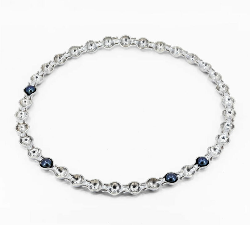
Photo: Point Two Five
PERLA
Got the wonderful opportunity earlier this year, to design jewelry pieces for POINT TWO FIVE a new Birmingham based jewelry brand, as a part of their launch collection. Crafted from Recycled 925 silver and freshwater pearls, PERLA is a contemporary take on the silhouette of a classic pearl necklace. By removing the pearls from the necklace’s traditional form, my process resulted in a piece that’s shaped by their absence.
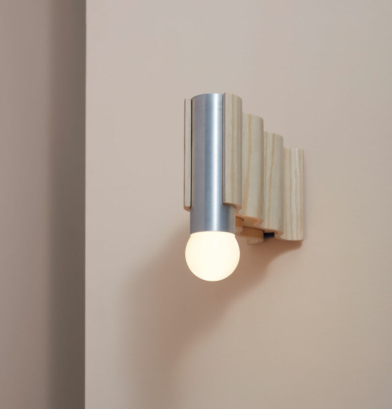
Photo: David Wilman
Corrugation Light collaboration with Tino Seubert
The Corrugation lights series was meticulously designed with sustainability at its core, exemplifying the principle of “form follows function.” Typically, the series comprises veneer-formed ash and off-the-shelf aluminum tubes, seamlessly merging the worlds of craftsmanship and industry into a harmonious whole.
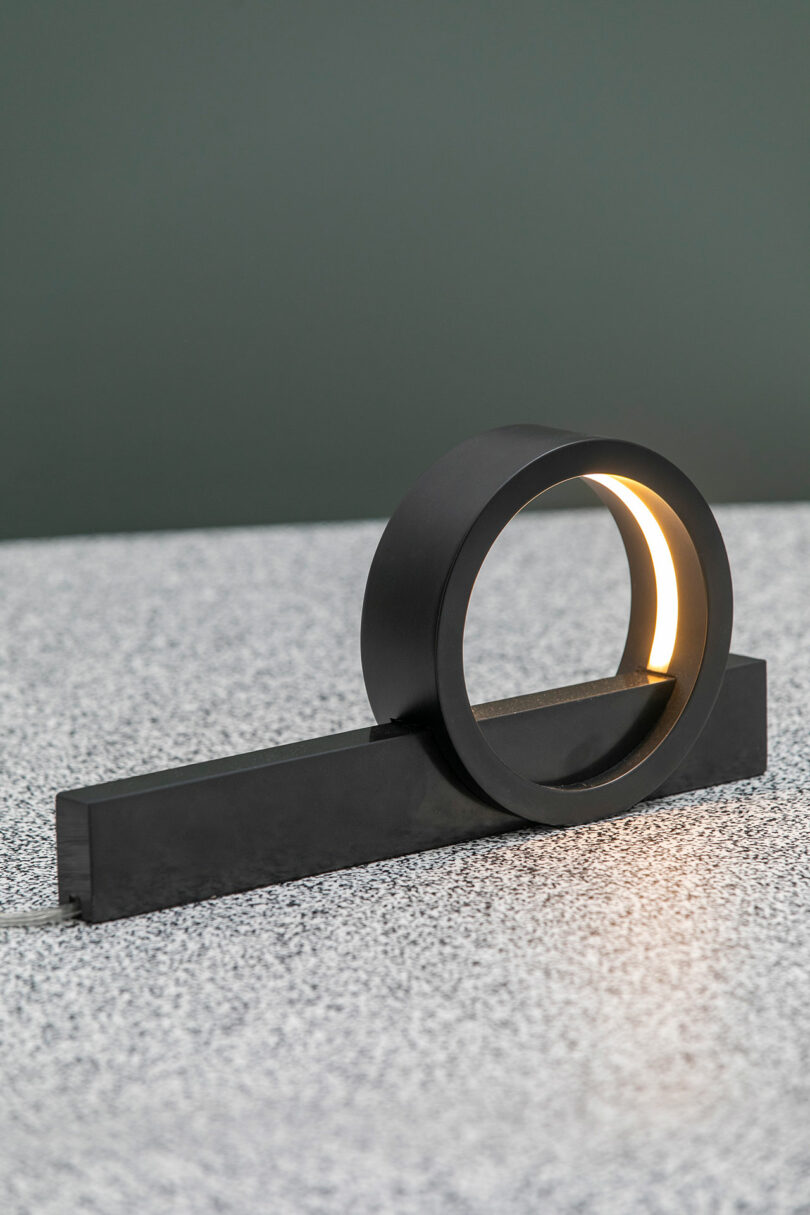
Photo: Folk Reykjavik
Composition Light for FÓLK REYKJAVÍK
Playing with the composition of simple forms and pure natural materials, the Composition light is a simple narrative of light, structures and textures. Using standardised aluminium tube and a block of marble, the production produces little to no waste.
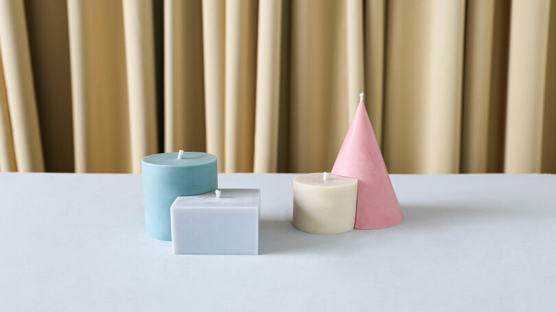
Photo: Theodora Alfredsdottir
Coupled soy wax candles that can stand alone or snuggle up together.

